
Creating a Schema-Based Form System
View the Source or Demo for the schema-based form system described in this article.
Working with forms on the front end is tedious and repetitive. If you don't have a good system set up, it can involve a lot of copy and pasting. If you have a bad abstraction, it can be much worse.
I've worked with some nightmare systems that were significantly worse than just manually writing all the form logic, error handling, validation, dirty state, etc. But nonetheless, taking care of all that can really start to add up and take a lot of time.
Wouldn't it be nice if we could do something like this: define the schema of a form and pass it into a component that takes care of all the common form needs...
const ExampleForm = () => {
  const schema = [
    { name: 'name', label: 'Name', componentType: 'text', required: true },
    {
      name: 'class',
      label: 'Class',
      componentType: 'select',
      options: [
        { value: 'ranger', label: 'Ranger' },
        { value: 'wizard', label: 'Wizard' },
      ],
    },
  ]

  return <AdvancedForm schema={schema} onSubmit={handleSubmit} />
}
Instead of writing all this: handling the values, errors, validation, and components manually?
const ExampleForm = () => {
  const [formValues, setFormValues] = useState({})
  const [errors, setErrors] = useState({})
  const [touched, setTouched] = useState({})

  const handleSubmit = () => {
    /* ... */
  }

  return (
    <form onSubmit={handleSubmit}>
      <label htmlFor="name">Name (required)</label>
      <input
        type="text"
        id="name"
        name="name"
        value={value}
        onChange={() => {
          /* ... */
        }}
      />

      <label htmlFor="class">Class</label>
      <select
        id="class"
        name="class"
        value={value}
        onChange={() => {
          /* ... */
        }}
      >
        <option key="ranger" value="ranger">
          Ranger
        </option>
        <option key="wizard" value="wizard">
          Wizard
        </option>
      </select>

      <button type="submit">Submit</button>
    </form>
  )
}
I made an example GitHub repo and demo of such a system. This follows the rule from the Tao of React - Do not hardcode markup.
Of course, disclaimer time, this isn't a production-ready repository with tests and edge cases accounted for and every type of form component includes and bindings for different frameworks - it's just an example that you can use to learn from or build from.
The simple example I made does include a text field, select, checkbox, radio group, text area, as well as conditional fields. To make it useful for the real world, you could integrate it with your UI framework of choice (such as Material UI or Semantic UI) if you're using one, or you can add support for multi-selects, checkbox groups, asyncronous responses, and much more!
Technology
Although I'm not using a UI framework in the example to handle form component styles, I am using a library to handle values and form submission - Formik. It's an extremely widely-used tool for working with forms that takes care of much of the annoying stuff, while still being simple under the hood and not bringing in theb complexity of Redux, MobX, observables, or anything else - just simple React state.
Additionally, Yup can be used for validation, in order to avoid writing all the same common regex over and over again.
Using Formik in the project makes it easy to abstract it out and allow us to pass some simple schema in.
Form System
Based on the example I showed above, you can see that a schema property will get passed in, as well as the onSubmit handler. This is basically enough for any "create" form, and for an "edit" form, I've also added an initialValues prop that can pre-populate the form with any existing values.
I'm using the <Formik> component (reference) from Formik to build this system. It contains render props that contain all the values in the entire form at all times, as well as some helpers like isValid or isSubmitting, which let you know the current state of the form.
import { Formik, Field } from 'formik'

import { getInitialValues, getDefaultValues, getValidationSchema } from './helpers'

export const AdvancedForm = ({ schema, onSubmit, initialValues, ...props }) => {
  const defaultValues = getDefaultValues(schema)
  const validationSchema = getValidationSchema(schema)

  return (
    <Formik
      initialValues={getInitialValues(defaultValues, initialValues)}
      validationSchema={validationSchema}
      onSubmit={onSubmit}
      validateOnMount
      {...props}
    >
      {({ handleSubmit, isSubmitting, isValid, values }) => {
        return (
          <form onSubmit={handleSubmit}>
            {/* Form schema components will go here */}
            <button type="submit" disabled={!isValid || isSubmitting}>
              Submit
            </button>
          </form>
        )
      }}
    </Formik>
  )
}
Get default values for the schema
Before I go into creating and rendering the components, we want to make sure we get default values for all the items in the schema.
This means if the schema looks like this:
const schema = [
  { name: 'name', label: 'Name', type: 'text' },
  { name: 'is_manager', label: 'Is Manager', type: 'checkbox' },
]
We want a default values object that looks like this:
const defaultValues = { name: '', is_manager: false }We can accomplish that by running through the schema and reducing it based on component type:
export const getDefaultValues = (schema) => {
  return schema.reduce((acc, val) => {
    let defaultValue

    switch (val.componentType) {
      case 'text':
      case 'textarea':
      case 'select':
      case 'radioGroup':
        defaultValue = ''
        break
      case 'checkbox':
        defaultValue = false
        break
      default:
        defaultValue = ''
    }

    return { ...acc, [val.name]: val.defaultValue || defaultValue }
  }, {})
}
This way, we're never passing in null or undefined values into the form, and it's always receiving the type it expects.
Get validation object for the schema
Just like the default values, we'll want a schema object. Using the Yup library, we can just pass in values, like Yup.string() for text fields, radio values, etc. and Yup.array() for something like a multi-select or checkbox group.
export const getValidationSchema = (schema) => {
  const validationObject = schema.reduce((acc, val) => {
    let validationType

    switch (val.componentType) {
      case 'text':
      case 'textarea':
      case 'select':
      case 'radioGroup':
        validationType = Yup.string()
        break
      case 'checkbox':
      default:
        validationType = null
    }

    if (val.required && validationType) {
      validationType = validationType.required(`${val.label} is required`)
    }

    return { ...acc, ...(validationType && { [val.name]: validationType }) }
  }, {})

  return Yup.object().shape(validationObject)
}
Now that I think about it, there's probably some way to use the Yup schema for both default values and validation, but I did not look further into it.
Set initial values
Now we can set the initial values - either the defaultValues by default, or a passed in initialValues if you're editing an existing form.
export const getInitialValues = (defaultValues, initialValues) => {
  if (!initialValues) return defaultValues

  return { ...defaultValues, ...initialValues }
}
All the setup for the form is there now, and now you can start creating bindings for whatever form components you want in the system.
Form Components
In this article, won't go into how to create all the individual form components (you can just view the source), I'll just focus on one, but for every type of form component that you want to include in the form system, make a file for it.
import { Checkbox } from './Checkbox.js'
import { Select } from './Select.js'
import { TextField } from './TextField.js'
import { TextArea } from './TextArea.js'
import { RadioGroup } from './RadioGroup.js'

export { Checkbox, Select, TextField, TextArea, RadioGroup }
Now back in the main AdvancedForm component, you can import all those components and put them in an array. When looping through the schema, you can now find the correct component to render. The component will be rendered using the Formik <Field> component (reference), which gives you access to the onChange events, touched, errors, values, etc. for each form field.
import { Formik, Field } from 'formik'

import { getInitialValues, getDefaultValues, getValidationSchema } from './helpers'

// Import all the form components and map them to their respective schema componentTypeimport { Checkbox, Select, TextArea, TextField, RadioGroup } from '.'const components = [  { componentType: 'text', component: TextField },  { componentType: 'textarea', component: TextArea },  { componentType: 'select', component: Select },  { componentType: 'checkbox', component: Checkbox },  { componentType: 'radioGroup', component: RadioGroup },]
export const AdvancedForm = ({ schema, onSubmit, initialValues, ...props }) => {
  const defaultValues = getDefaultValues(schema)
  const validationSchema = getValidationSchema(schema)

  return (
    <Formik
      initialValues={getInitialValues(defaultValues, initialValues)}
      validationSchema={validationSchema}
      onSubmit={onSubmit}
      validateOnMount
      {...props}
    >
      {({ handleSubmit, isSubmitting, isValid, values }) => {
        return (
          <form onSubmit={handleSubmit}>
            {schema.map(({ componentType, condition, ...formSchema }) => {              // Find the correct component from the schema based on componentType              const Component = components.find(                (component) => component.componentType === componentType              ).component              // Pass the formSchema data into the Field component              return <Field key={formSchema.name} component={Component} {...formSchema} />            })}            <button type="submit" disabled={!isValid || isSubmitting}>
              Submit
            </button>
          </form>
        )
      }}
    </Formik>
  )
}
Now you can actually make the bindings for each form type.
Text field component
All the data gets passed down to the <Field>, such as the onChange, onBlur, whether or not it has been touched or has errors, and then anything special you want to add to it. For example, the Select component would have an options prop so you can pass down a list of all the key/values for the select options.
Here is an example of a simple text field input. This could also be extended and modified to have an email type, a password type, or anything else you might want a regular input to be able to handle.
export const TextField = ({
  label,
  field: { name, value, ...fieldProps },
  form: { touched, errors },
  required,
  ...props
}) => {
  const hasError = errors[name] && touched[name]

  return (
    <>
      <label htmlFor={name}>
        {label}
        {required && <sup className="required">*</sup>}
      </label>
      <input type="text" id={name} name={name} value={value} {...fieldProps} {...props} />
      {hasError && <small className="error">{errors[name]}</small>}
    </>
  )
}
The same code can be extended for checkboxes, radios, selects, multi-selects, radio groups, sliders, and any other form type you need.
Required
In the getValidationSchema helper, we set up default types for each field in the schema. If one of them has required: true in the schema, and nothing is entered, an error will appear that says "[label name] is required".
if (val.required && validationType) {
  validationType = validationType.required(`${val.label} is required`)
}
The way the form is set up, empty values won't start off in an error state, but if they're touched and not filled out, then the error state will appear.
Errors
You can check if an error exists by seeings if the related error exists and the field has been touched.
const hasError = errors[name] && touched[name]Conditional Fields
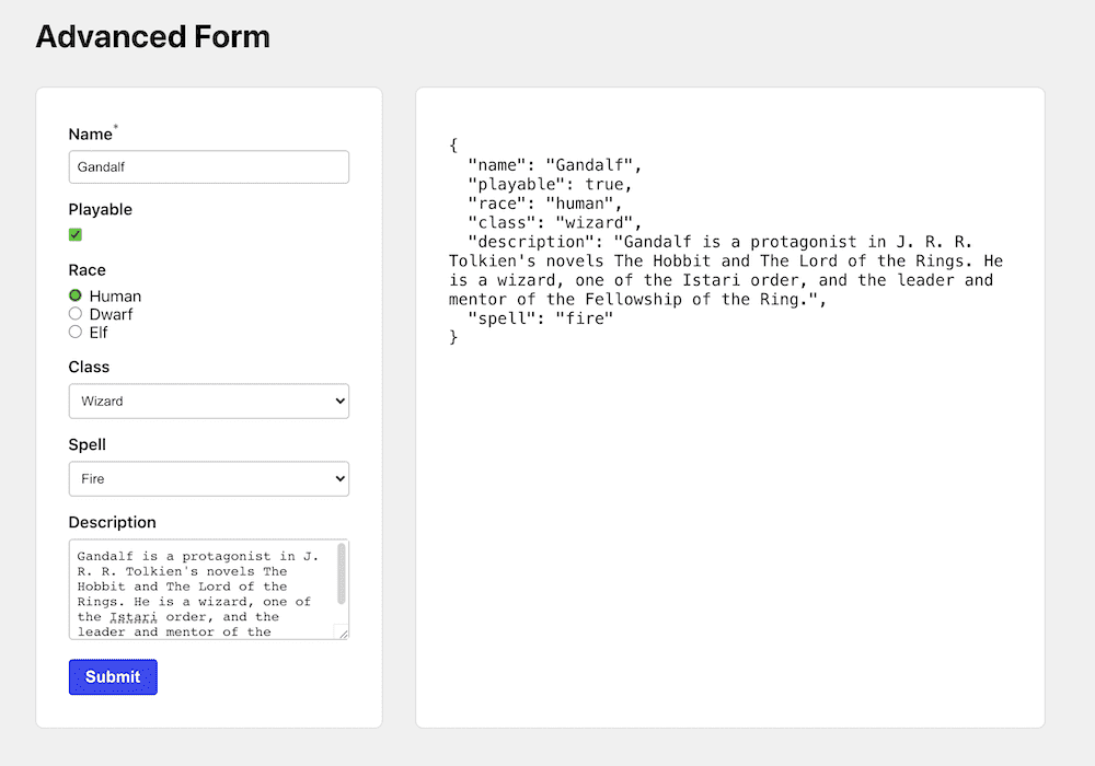
I added a little bonus where you can make certain fields only appear if certain conditions are met. This example schema is set up with key, value, and operator of the condition.
There's a "Class" select, that has Ranger, Wizard, and Healer as options. If you select Wizard, then another field pops up with the Spell select.
condition: { key: 'class', value: 'wizard', operator: '=' },Here's the whole schema:
const schema = [
  {
    name: 'class',
    label: 'Class',
    componentType: 'select',
    options: [
      { label: 'Ranger', value: 'ranger' },
      { label: 'Wizard', value: 'wizard' },
      { label: 'Healer', value: 'healer' },
    ],
  },
  {
    name: 'spell',
    label: 'Spell',
    componentType: 'select',
    options: [
      { label: 'Fire', value: 'fire' },
      { label: 'Ice', value: 'ice' },
    ],
    condition: { key: 'class', value: 'wizard', operator: '=' },
  },
]
In the advanced form, you can check for condition and render a ConditionalField wrapper around the field that will hide, show, and add default values as needed.
// ...

if (condition) {
  return (
    <ConditionalField
      key={formSchema.name}
      show={
        condition.operator === '='
          ? values[condition.key] === condition.value
          : values[condition.key] !== condition.value
      }
      onCollapse={() => {
        setFieldValue(formSchema.name, defaultValues[formSchema.name])
        setFieldTouched(formSchema.name, false)
      }}
      onShow={() => {
        setFieldValue(formSchema.name, defaultValues[formSchema.name])
      }}
    >
      <Field component={Component} {...formSchema} />
    </ConditionalField>
  )
}

// ...
The component is a simple conditonal gate that renders children if the conditon is met.
import { useEffect } from 'react'

export const ConditionalField = ({ show, onCollapse, onShow, children }) => {
  useEffect(() => {
    if (show) {
      onShow()
    } else {
      onCollapse()
    }
    // eslint-disable-next-line react-hooks/exhaustive-deps
  }, [show])

  return show ? children : null
}
Conclusion
So there you have it, with the combined power of Formik and Yup, you can build an abstraction to drastically reduce the amount of code you have to write overall to work with forms. The concepts outlined in this article can be extended to any component library...Material UI, Ant Design, Blueprint, Semantic UI, or just plain HTML and CSS as seen here.
The conditional code here is very simple, relying on whether certain items were selected or not in the form, but you could use something like JSON schema to extend it further. A lot more component types can be created, such as an email type that has a default email regex added to the validationObject, and a multi-select dropdown component type. You might also want to factor in asynchronous conditionals.
Hopefully this article helped you think more about defining data upfront and passing it into components as opposed to hard-coding markup and manually handling form state. There will always be some situations an abstraction doesn't handle well or at all, and in those cases you might need to manually work with your form, but a system like AdvancedForm can help in many common situations.
View the Source or Demo for the schema-based form system described in this article. Thanks for reading!
Comments